Ask Our Editor:Art 101

This week our team partnered with the interior design services site, Havenly, to have a conversation with their designers about art! We called on our editor, Michelle Adams, to chat Art 101 followed by a Q&A, and thought we'd share Michelle's answers to a few of our favorite questions below.
Q: What is the most chic way to display family photos?
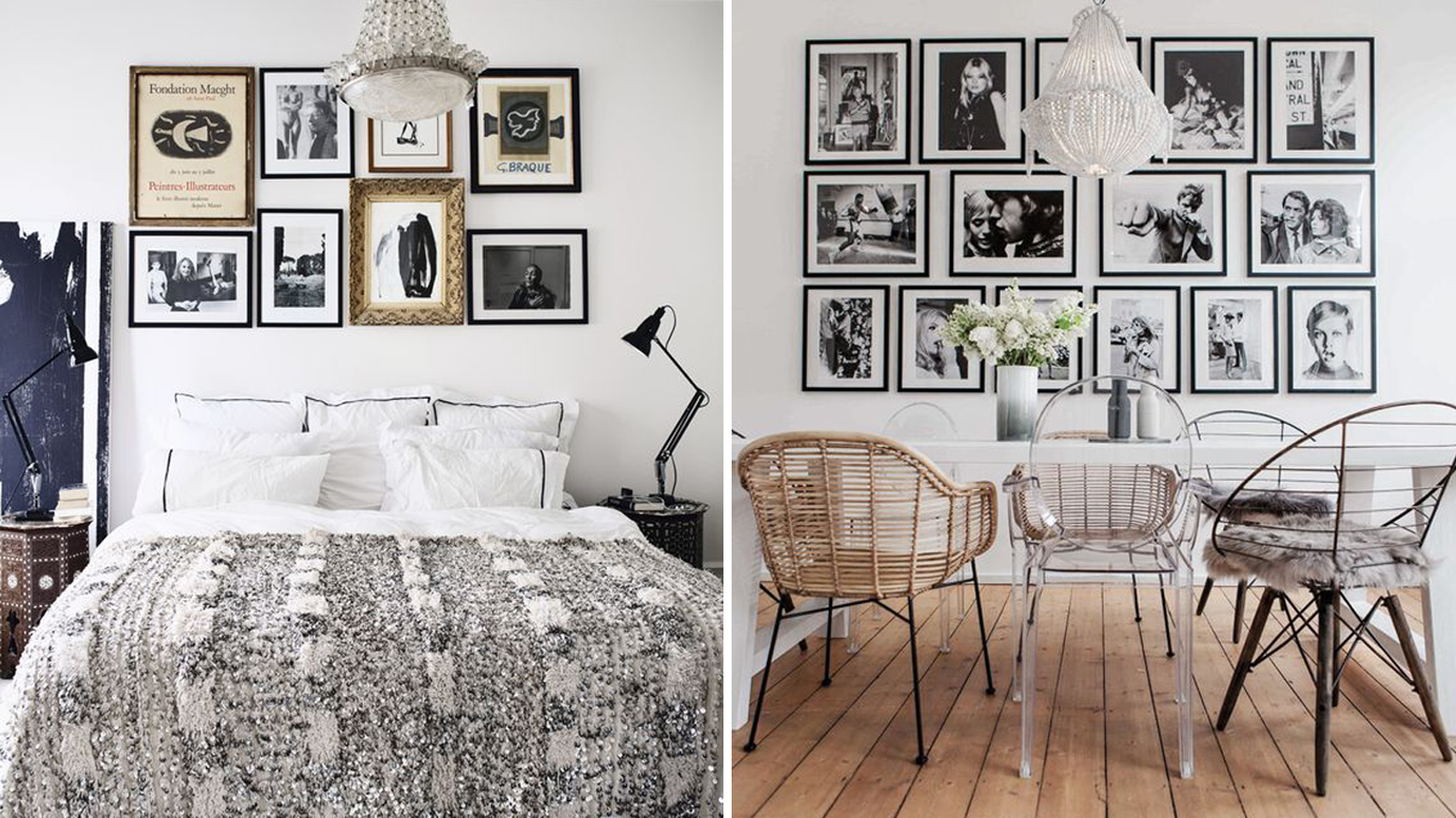
A: That's a great question! Homes without family photos often feel impersonal, yet too many family photos can make a home look cluttered. Personally, I look to some of my favorite interior designers for inspiration--India Hicks and David Netto. India's method, shown above, is to print out her family photos in black & white or sepia tones to give a consistent look to the grouping. Then she frames them in neutral toned frames--black, white, wood, silver and gold. The lack of color throughout ensures that the grouping doesn't become a cluttered mess, while multiple family photos grouped in one spot tells a narrative of India's family history.
Another option for tabletop display is to place your favorite family photos in a lucite block, a favorite look of interior designer David Netto. My go-to lucite frames are by Canetti.
Q: When designing for a client, how do you choose art that is still personal to them?
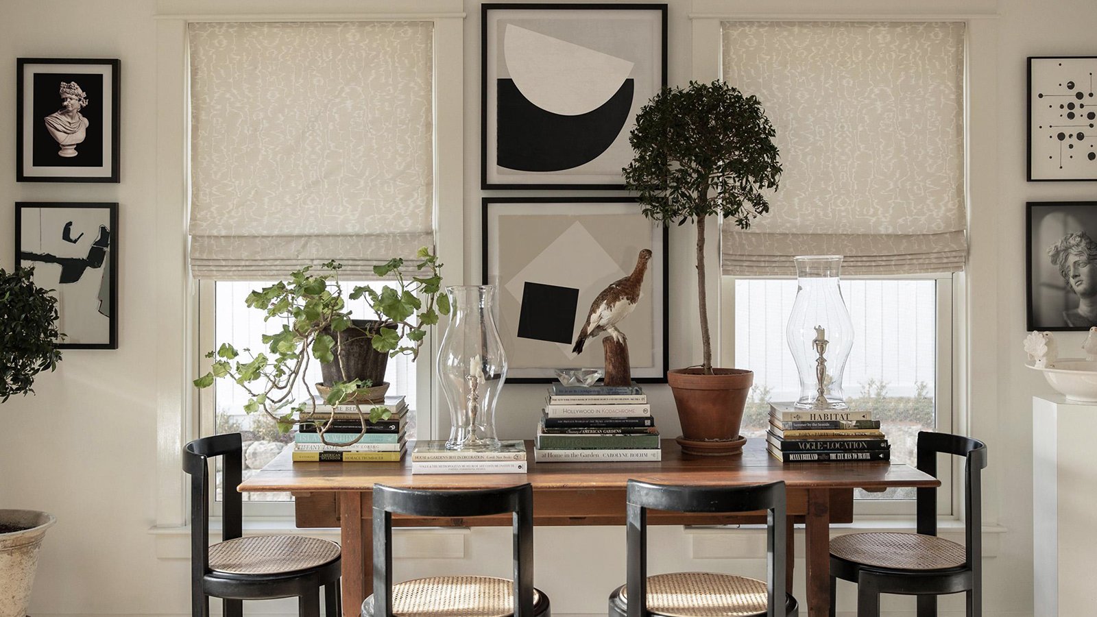
A: Art tends to be a very personal decision for most people, as it's a matter of personal taste above all else. So designing a home for another person can be tricky when it comes to choosing art. My recommendation is to ask as many questions as possible to truly understand your client's interests. Did she study abroad in college? Does she have a favorite pet? Favorite grandparent? Where does she like to travel? What artists does she admire? What does she feel passionate about? When you dig deep to understand a person, you can more easily select art that speaks to them. Most clients will be grateful and impressed that you took the time to learn their interests and were thoughtful enough to incorporate them into the design of their home. In the examples above, family photos are mixed in with art depicting travel destinations, pets, historical figures and modern abstracts.
Q: I noticed that Artfully Walls offers a red frame. What is the best way to incorporate it into my decor?
Family photographs are hung salon style in the rear stairwell of a Brooklyn brownstone decorated by Nick Olsen.
A: Our red frame option can feel intimidating to try but is actually a fun design statement! The gallery wall above is by my friend Nick Olsen and it comes to life thanks to his choice of red frames. We recommend pairing a red frame with black and white art so as to minimize conflicting colors.
Q: Do you recommend creating a gallery wall around a TV to help disguise it?
A: Absolutely! Gallery walls are an excellent way to help disguise a TV, which can otherwise become an undesired focal point. I find the two examples above to be helpful guides. The first image depicts a TV hung on a wall as part of a gallery and the second shows a TV on a media stand with art on the wall behind it (to distract the eye). Both methods are effective and chic.
Q: I have very high ceilings in my living room. What do you recommend I hang?
Designer Julia Leach in her stylish Venice Beach home.
Designer Thomas O'Brien uses one large piece of art and keeps the remaining wall space empty and serene.
A: This is another great question, and tends to be a design challenge that people struggle with. I recommend going one of two ways: either stack a gallery high up the wall, or place one large piece lower on the wall and embrace the empty space above it. Examples of both methods are shown above and they feel equally as elegant to me.


