Advice From A Designer | Anthony Gianacakos

Photo by Marta Xochilt Perez, styling by Benjamin Reynaert, interior design by Anthony George Home.
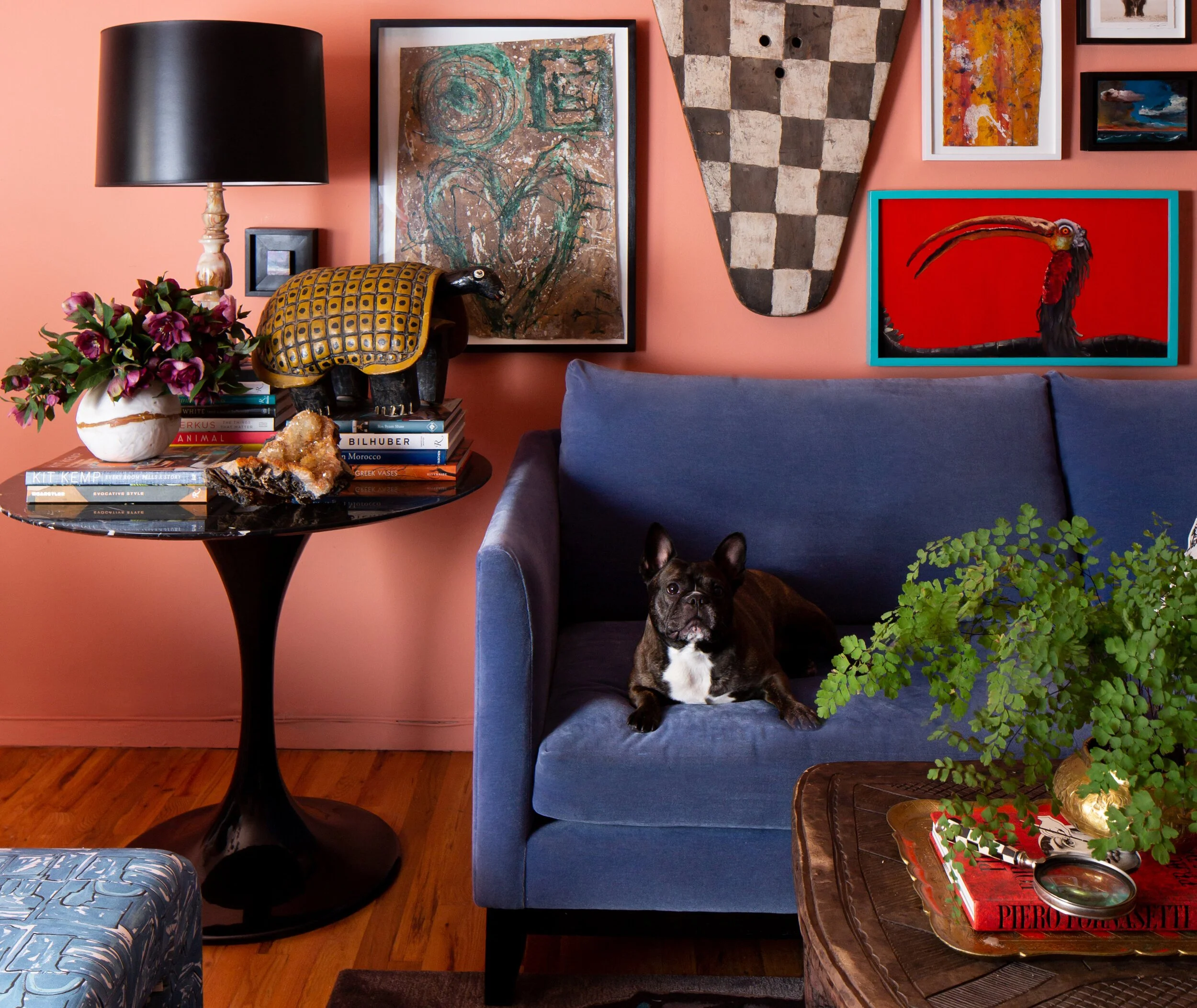
In his latest project, a one bedroom apartment in Manhattan’s Washington Heights neighborhood, designer and artist Anthony Gianacakos breaks the mold with bold pattern, bright colors, and his refreshingly simple method for hanging art. “I don't have a plan,” says Gianacakos. “I have a hammer and picture hooks and I just go for it.” The designer firmly believes that hanging art should be an organic process. “Let it unfold as you hang each piece, instead of having a structured and mapped out plan." To take off the pressure, the designer also recommends keeping some spackle and a little paint on hand for light touchups, or some 3M hooks to avoid making holes in the first place. Read on for more tricks of the trade.
Photo by Marta Xochilt Perez, styling by Benjamin Reynaert, interior design by Anthony George Home.
Dream In Color
“White walls seem to be the norm these days, but I find it so much more interesting to start with a rich hue as the foundation and layer art on top. Here I used Antique Coral and Coral Spice by Benjamin Moore.”
Photo by Marta Xochilt Perez, styling by Benjamin Reynaert, interior design by Anthony George Home.
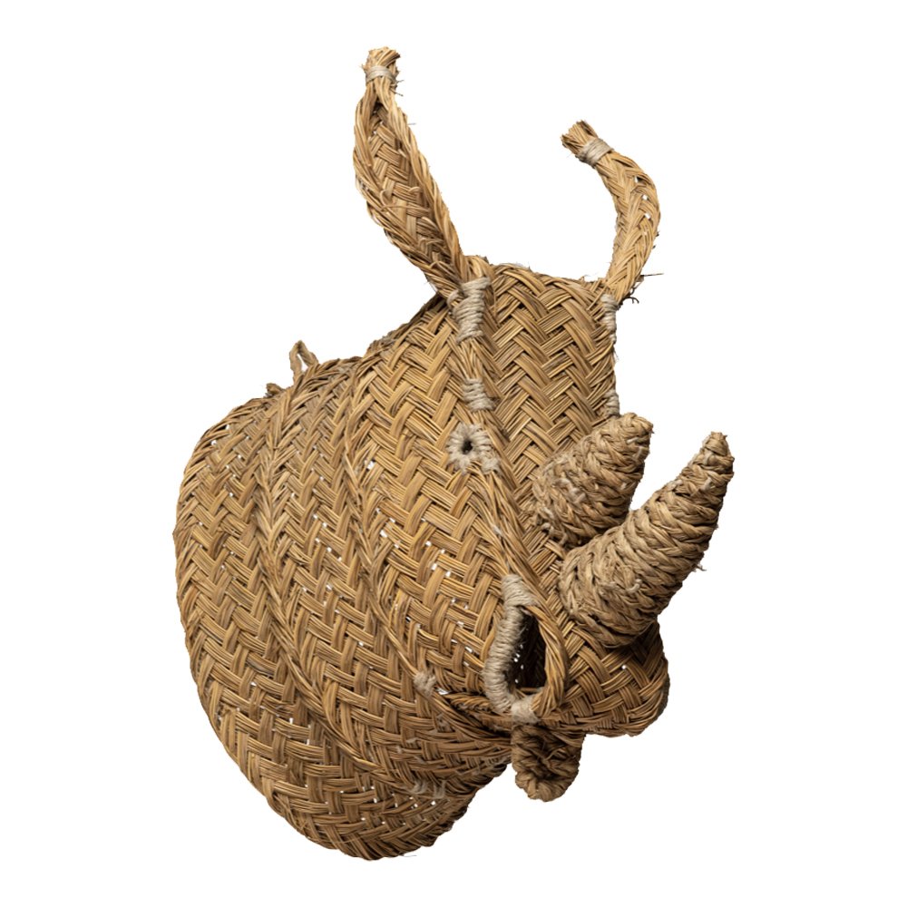
Make it 3D
“I love mixing sculpture with art to create depth and interesting texture. These woven busts by Madrid artist Javier Medina are my go-to’s.”
Photo by Marta Xochilt Perez, styling by Benjamin Reynaert, interior design by Anthony George Home.
Let Nature Inspire You
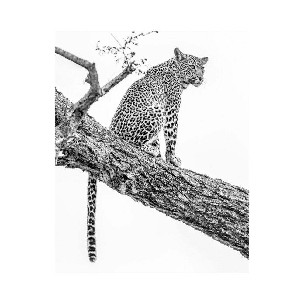
“I love animals...probably more than people, LOL, so I always include them in my projects through art, sculpture and pattern. I’m currently eyeing this piece by Lana Effron.”
Photo by Marta Xochilt Perez, styling by Benjamin Reynaert, interior design by Anthony George Home.
Consider The Balance
“In spaces meant to be relaxing, like bedrooms, I usually opt for symmetry. You can of course loosen up the symmetry a bit like I did here to keep rooms from feeling too predictable.”
Photo by Marta Xochilt Perez, styling by Benjamin Reynaert, interior design by Anthony George Home.
Photo by Marta Xochilt Perez, styling by Benjamin Reynaert, interior design by Anthony George Home.
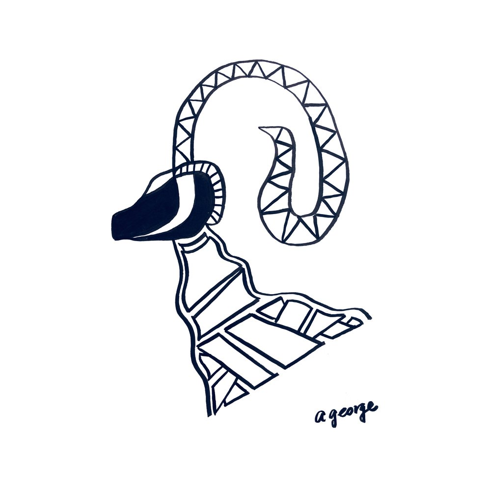
Abstract Bull by Anthony George.
Embrace The Curves
“Gallery walls are often very angular, hung in a tight grid of small rectangles. I love adding unexpected shapes and organic curves to the mix. ”
Vintage Zulu shield, via Etsy
Know When To Fly Solo
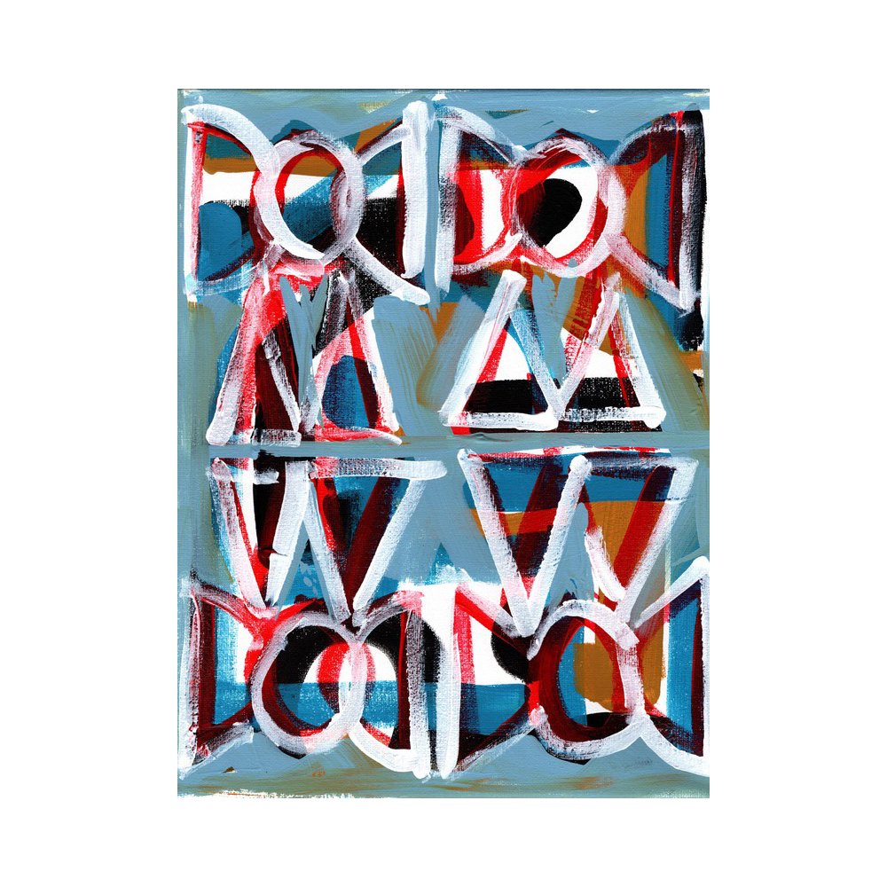
“A grouping of art isn’t the only way to make a statement. Sometimes less really is more. ”
Blue by Kurt Waldo
