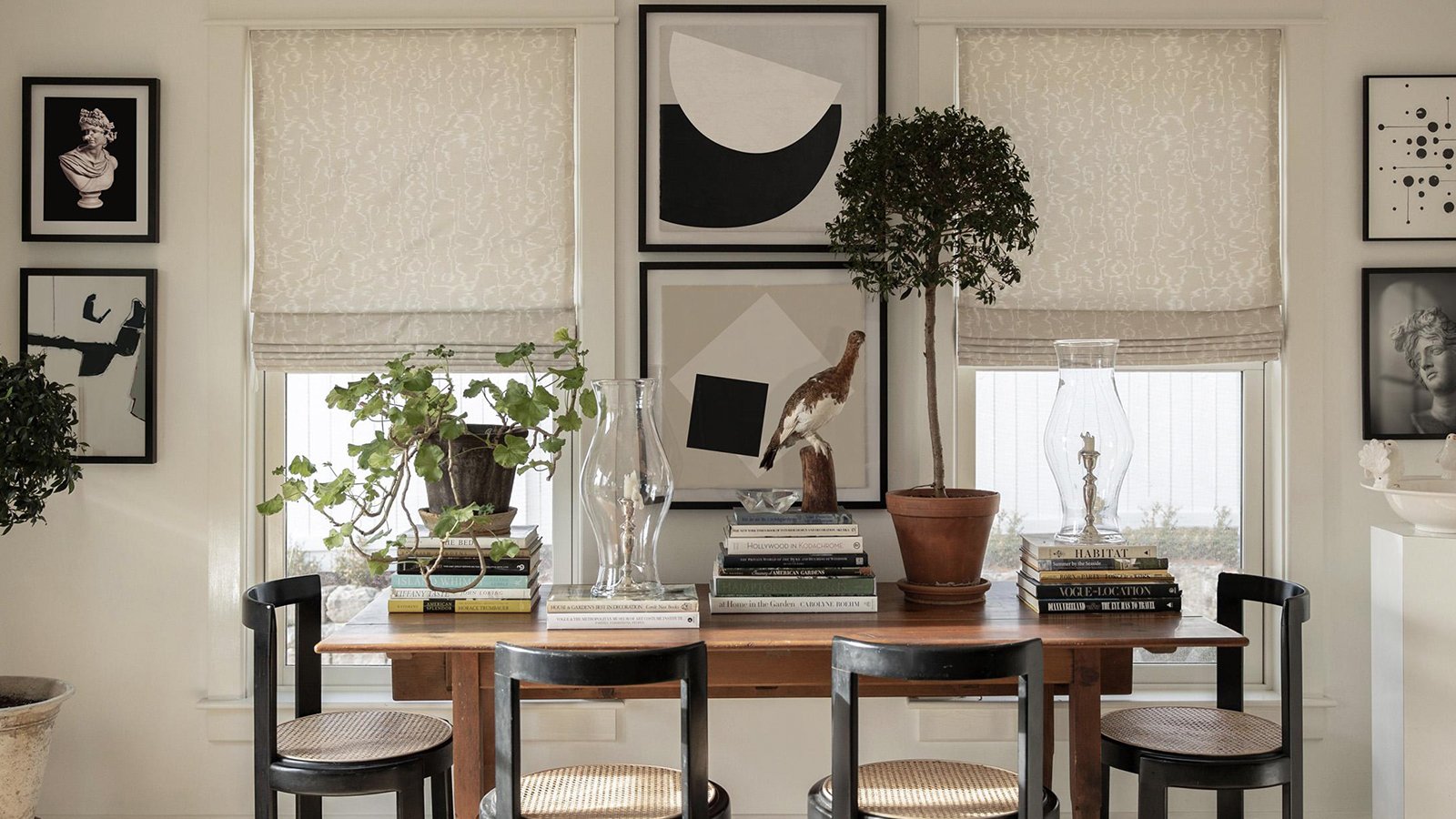
How to Style Art with Colored Mats


Adding a colored mat is a simple way to make your artwork pop—and now, it’s even easier. We’re excited to introduce three new mat options in red, indigo, and green, expanding beyond our classic white. These bold hues can add contrast, highlight tones within the artwork, or bring a fresh perspective to timeless pieces.
Not sure where to start? Below, we’ve highlighted six ways to nail the look using colored mats in your space.
Botanicals
A colored mat brings out the natural tones in botanical prints and adds warmth or depth depending on your palette. Try pairing a leafy illustration with a green mat to echo the subject—or contrast it with red for a more dramatic statement.


Black & White Photography
Colored mats are a great way to add interest to black and white photographs without overwhelming them. Indigo, in particular, offers a moody, modern edge that frames the image with a subtle richness.


Line Drawings
Simple, minimal line drawings can feel more intentional and elevated when paired with a colored mat. Try red or indigo to add structure and contrast while keeping the artwork’s delicate feel intact.


Complementary Tones
When a mat picks up one of the accent colors in the artwork itself, the whole piece feels more cohesive. A green mat paired with a piece featuring earthy or forest tones, for example, helps the art feel grounded and unified.


Architectural Studies
Line-heavy architectural prints can benefit from the depth that a darker mat provides. Indigo adds sophistication and draws the eye inward, enhancing the precision and geometry of the piece.


Silhouettes
In silhouette-style pieces, a bold mat can almost become part of the composition. A colored border acts as a strong frame, emphasizing the negative space and reinforcing the graphic impact of the artwork.


Michelle Adams